
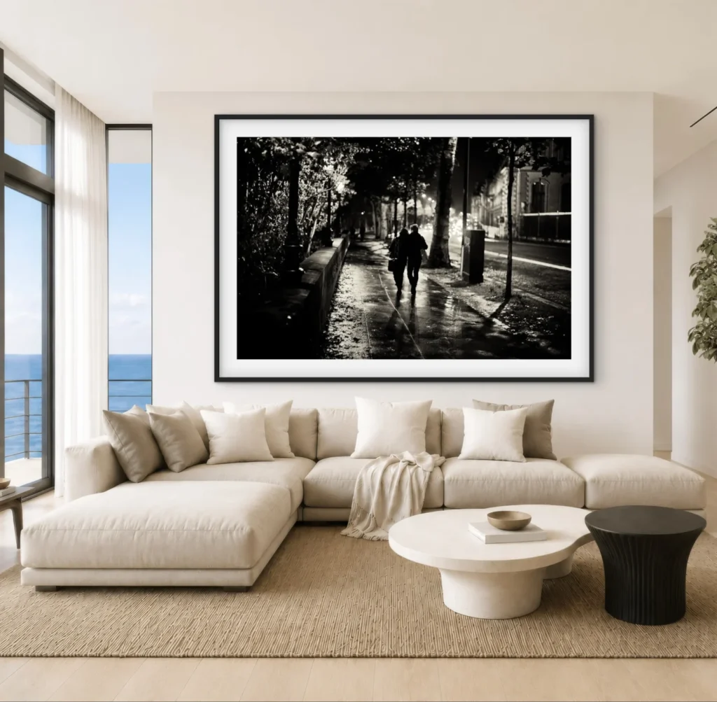
There’s a persistent myth in interior design that “romantic” art belongs in the bedroom and nowhere else — that it’s too intimate, too soft, too specific a mood to live in a hallway or a kitchen.
At The Cow Artworks, we’d argue the opposite. Romantic photography, chosen well, is one of the most effective tools for shaping the emotional register of an entire home. Not because it depicts romance in the narrow, candlelit-dinner sense, but because the visual language of romantic photography — warmth, softness, closeness, unguarded light — does something measurable to how a room feels to be in.
What “Romantic” Actually Means in Photography
The word gets misused. In a gallery context, romantic photography isn’t limited to couples, weddings, or sunset silhouettes — that’s a narrow, commercial slice of a much larger tradition. Romantic, in the photographic sense, describes a treatment of the subject rather than the subject itself. It’s characterised by:
• Soft, directional light — often golden hour, window light, or diffused overcast conditions rather than hard flash or flat midday sun
• Intimacy of framing — closer crops, shallower depth of field, a sense that the viewer has been let in rather than kept at a documentary distance
• Tonal warmth — amber, rust, cream, dusty rose; the palette of skin and late sun rather than the cool blues of clinical or architectural photography
• Imperfection and grain — film texture, motion blur, the trace of a human hand behind the camera
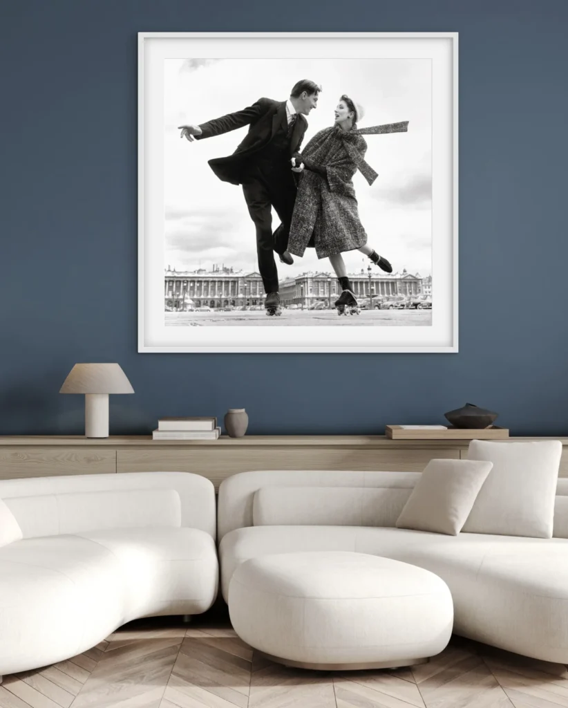
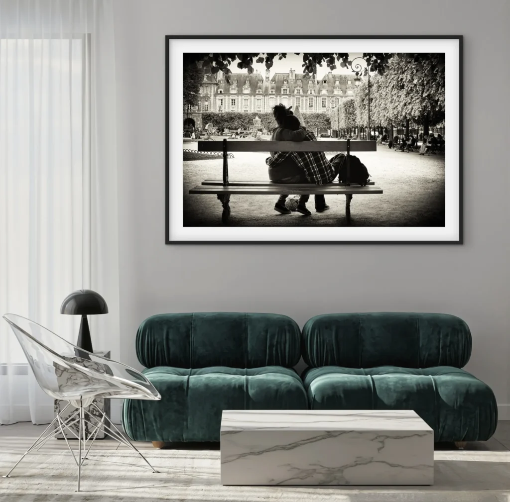
Why Warmth on a Wall Changes a Room
There’s a reasonably well-supported line of research in environmental psychology showing that warm colour temperatures and soft-focus imagery lower perceived arousal in a space — meaning the room reads as calmer, slower, less demanding of attention. This is part of why hospitality design leans so heavily on warm-toned photography in lobbies and restaurants: it’s not aesthetic laziness, it’s mood engineering.
What’s less discussed is the content effect layered on top of the colour effect. Images of closeness — two hands, a shared glance, a figure caught mid-laugh — activate a different kind of attention than images of scale or drama (a dramatic mountain range, a stark architectural line). Romantic photography asks less of the viewer. It doesn’t demand to be decoded or admired for technical bravado; it invites a kind of passive comfort. That’s precisely what a living room, a bedroom hallway, or a reading nook needs — art that lets the nervous system settle rather than art that performs.
This is worth saying plainly because it cuts against a common assumption in art buying: that “important” art should be challenging. In a domestic setting, that’s often the wrong brief entirely. A home is not a museum. It’s a place people return to when they’re tired, and the art on the walls is either doing work to help with that or it’s fighting the room.
Part of what a photographic gallery offers to match a photographic mood. Romantic photography, done badly, is generic. Done well, it’s one of the few genres of art that changes how a room feels to occupy, not just how it looks to admire.


