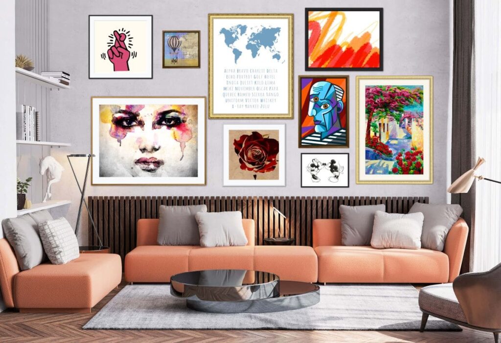
The perfect way to bring character into a space is by introducing a gallery wall. This can be a challenge as there are no strict rules for selecting a frame and how to do the layout. Here are some pointers on what to avoid when creating your own wall.
Not matching your wall
The gallery wall needs to complement the space and match your interior style. If you choose ornate frames they might not fit in well with a minimalistic room. It is best to match the frame style to the room.
If you prefer a mismatched look, you can choose different frames that can vary in size and thickness but we suggest you keep the style consistent for a refined and balanced look.
Not planning the layout
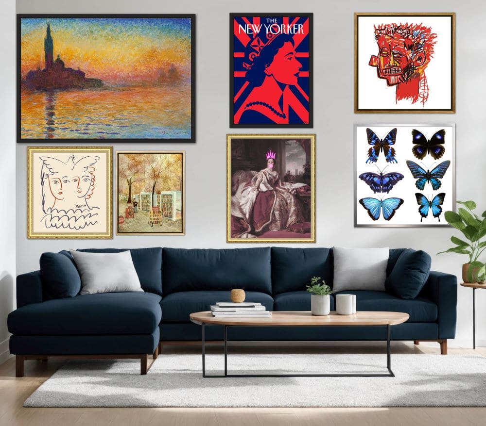
Selecting the right frames and art pieces aren’t the only factors to be taken into consideration when creating a gallery wall. Positioning your pieces correctly makes a big difference to the end result. It is important to plan your layout before you get the hammer and nails out.
Measure the height and width of your wall to determine the gallery wall size. Lay out all your frames on the floor to create the arrangements. This makes it a lot easier to create the layout on the wall and fix the odd shapes and sizes. You can also mark the frames directly on the wall with tape. By following these steps it will make it easier to create a visually pleasing wall that flatters the room.
Not adding meaningful pieces
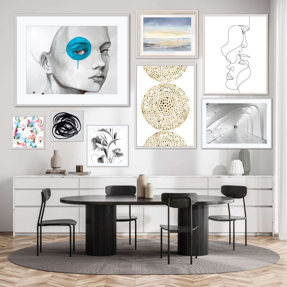
Here you shouldn’t fill up the wall with generic pieces that are just bought for the sake of filling the wall. Add pieces with meaning or with a background story that is relevant to you.
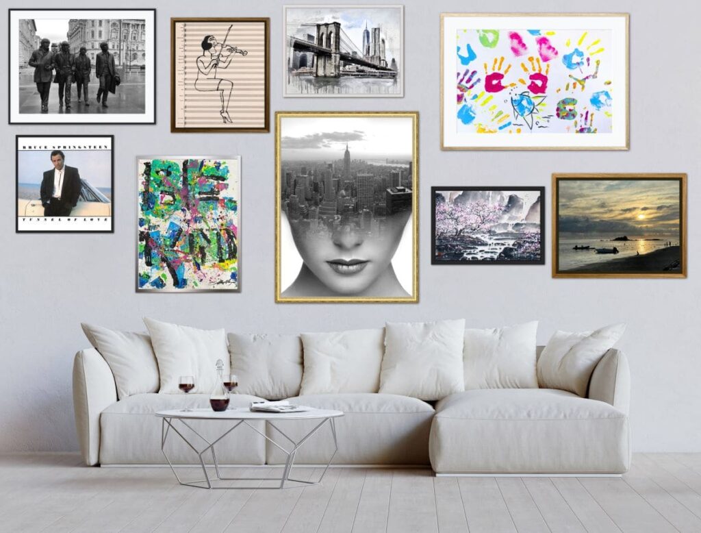
Enhance your collection with personal photos to bring some nostalgic charm. Displaying souvenirs and concert/movie posters is another idea.
Too much blank space
If you leave gaps between the frames leaves negative space which allows the beauty of each piece to stand out. It is very important to create the correct balance since too much space between your artworks can look awkward. A small gap between the frames leaves enough space to appreciate the individual pieces.
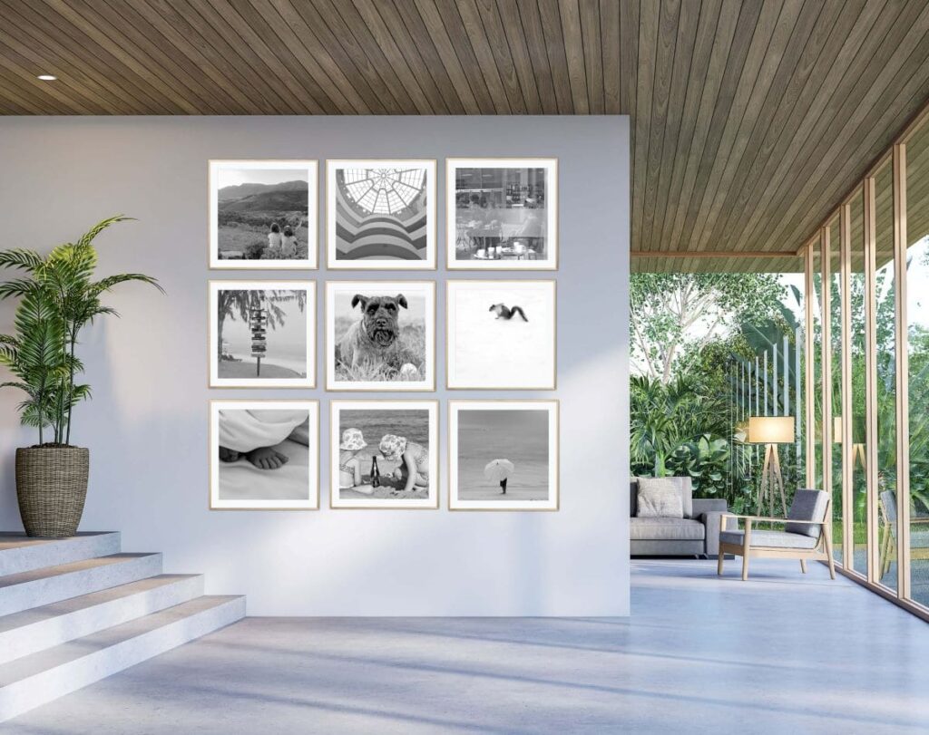
Ignoring Design rules
Some design principles should not be overlooked such as that the best position is at eye level.
If the gallery wall is above a piece of furniture such as a sofa or a dresser, leave at least 30 cm of space between and ensure the gallery is centered above the furniture to create a harmonious look.