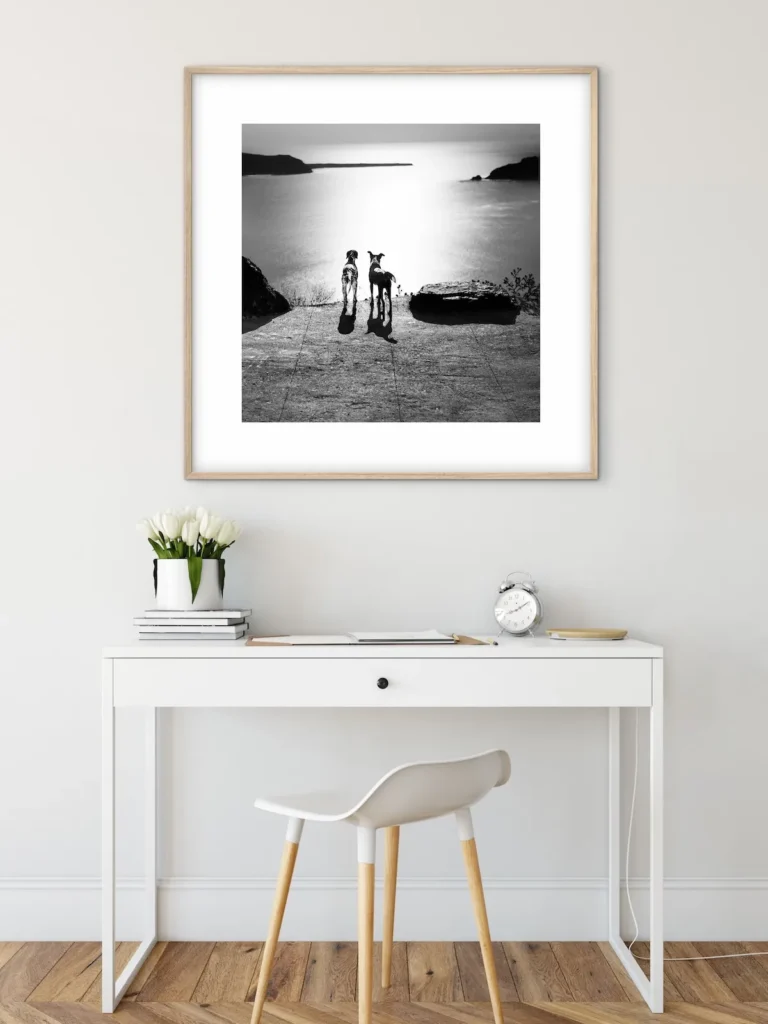
There’s a reason so many designers, architects, and creative professionals gravitate toward white when designing a workspace. It isn’t a trend — it’s a psychological and practical strategy. A white home office does more than look clean; it actively shapes how you think, feel, and work within it. Here’s why the colour (or rather, the absence of competing colour) matters, and how to keep the space from feeling sterile by dressing it with the right artwork.
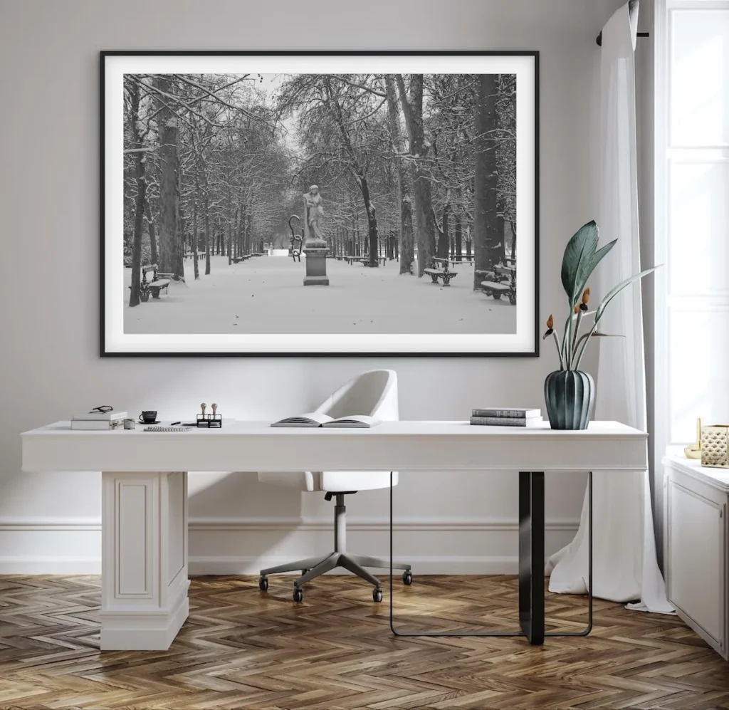
Why White Works: The Psychology of a Blank Canvas
- It reduces visual noise
Every colour in a room sends a small signal to your brain. Reds and oranges can raise alertness and even anxiety; busy patterns force your visual cortex to keep “parsing” the environment even when you’re not consciously aware of it. White removes that background chatter. With fewer competing stimuli, your mind has more bandwidth left for the actual task in front of you — a real advantage when the task is deep, focused work. - It creates a sense of spaciousness
White reflects rather than absorbs light, which makes a room feel larger and airier than its actual square footage. For home offices — which are often spare bedrooms, corners of a living room, or converted nooks — this matters enormously. A visually expanded room reduces the subtle claustrophobia that can creep in during long stretches at a desk, and studies on environmental psychology consistently link a sense of spaciousness to lower stress and higher perceived wellbeing. - It supports mental clarity and decision-making
There’s a reason so many minimalist productivity systems (think: the “clean desk” philosophy) pair naturally with white interiors. A neutral field means your eyes and mind aren’t drawn toward irrelevant visual information. This isn’t just aesthetic preference — it mirrors how attention works. The fewer decisions your environment silently asks you to make (“notice this pattern,” “process this colour contrast”), the more decision-making capacity you preserve for your actual work. - It’s inherently flexible
White is the only “colour” that never clashes. It plays well with wood tones, black accents, brass hardware, greenery, and — crucially for this discussion — nearly any artwork you hang on it. As your taste or business evolves, a white office doesn’t need to be redone; only the accessories do. This makes it a long-term investment rather than a seasonal choice.
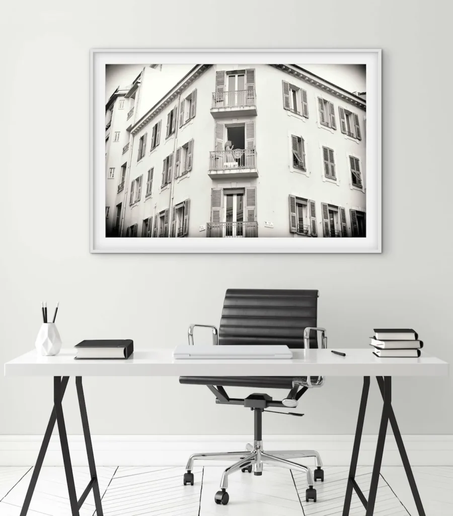
The Effect on Mood
White is often (unfairly) accused of feeling cold or clinical. In practice, the mood impact depends entirely on how the white is used:
- Warm whites (with subtle cream or beige undertones) feel inviting and soft, especially in natural light.
Cool whites feel crisp and energizing — good for tasks requiring alertness, less good if you already work long hours and want to unwind. - Textured whites — a lightly textured wall finish, linen curtains, a boucle chair — prevent flatness and add warmth without introducing colour.
- The key mood benefit isn’t the absence of feeling; it’s the absence of unintentional feeling. Colour you didn’t choose deliberately can quietly work against your mood all day. White lets you introduce mood elements — through art, light, and texture — on purpose.
The Effect on Productivity
Workspace research consistently points to a few environmental factors that most affect focus: light levels, visual clutter, and perceived order. White supports all three:
- Light amplification: white surfaces bounce natural and artificial light around the room, reducing eye strain and the fatigue that comes with dim, uneven lighting.
- Lower cognitive load: a visually “quiet” room requires less unconscious processing, which several attention-restoration studies associate with improved sustained focus.
- Perceived order: white makes mess more visible (a coffee ring, scattered papers), which paradoxically nudges most people toward tidier habits — and a tidier desk is reliably linked to better task completion.
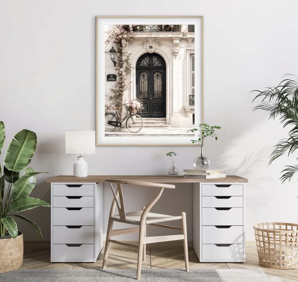
The Effect on Aesthetics
Aesthetically, white is the design equivalent of a blank page: it doesn’t compete, it frames. It’s the reason white-walled galleries have remained the industry standard for a century — the wall’s job is to disappear so the work on it can be seen clearly, without colour competition or shifting undertones distorting how the piece reads.
That same gallery logic applies beautifully to a home office. A white office isn’t “empty” — it’s a foundation built to showcase whatever you choose to put on it, whether that’s a bookshelf, a plant, or (especially) art.
Bringing It to Life: Decorating with Monochromatic Artwork
This is where a white office goes from clean to genuinely beautiful — and it’s where monochromatic (black-and-white, or single-tone) artwork earns its reputation as the natural pairing for white walls.
Why monochromatic art specifically
- It won’t fight the room. Because it shares the wall’s tonal restraint, monochromatic work reads as an extension of the architecture rather than an interruption of it.
- It photographs and reads beautifully in natural light, which most home offices rely on — grayscale tonal range shows up more dramatically under changing daylight than flat color blocks do.
- It adds depth without adding visual load. A black-and-white photograph or fine art print introduces contrast, texture, and emotion, while still preserving the calm the white walls were designed to create.
How to hang it well
- Choose one strong anchor piece over the desk or in the primary sightline — the wall you face on video calls, or the one you glance up at when thinking. A single large-format piece (framed fine art photography works particularly well) has more impact than several small ones scattered around.
- Vary tone, not colour. Mix a high-contrast black-and-white piece with a softer, low-contrast or sepia-toned print nearby. This keeps a monochrome gallery wall from feeling flat — you’re working with a full tonal range, not just “black and white.”
- Respect scale and breathing room. On white walls, negative space isn’t wasted space — it’s part of the composition. Leave generous margin around framed work rather than crowding pieces edge to edge.
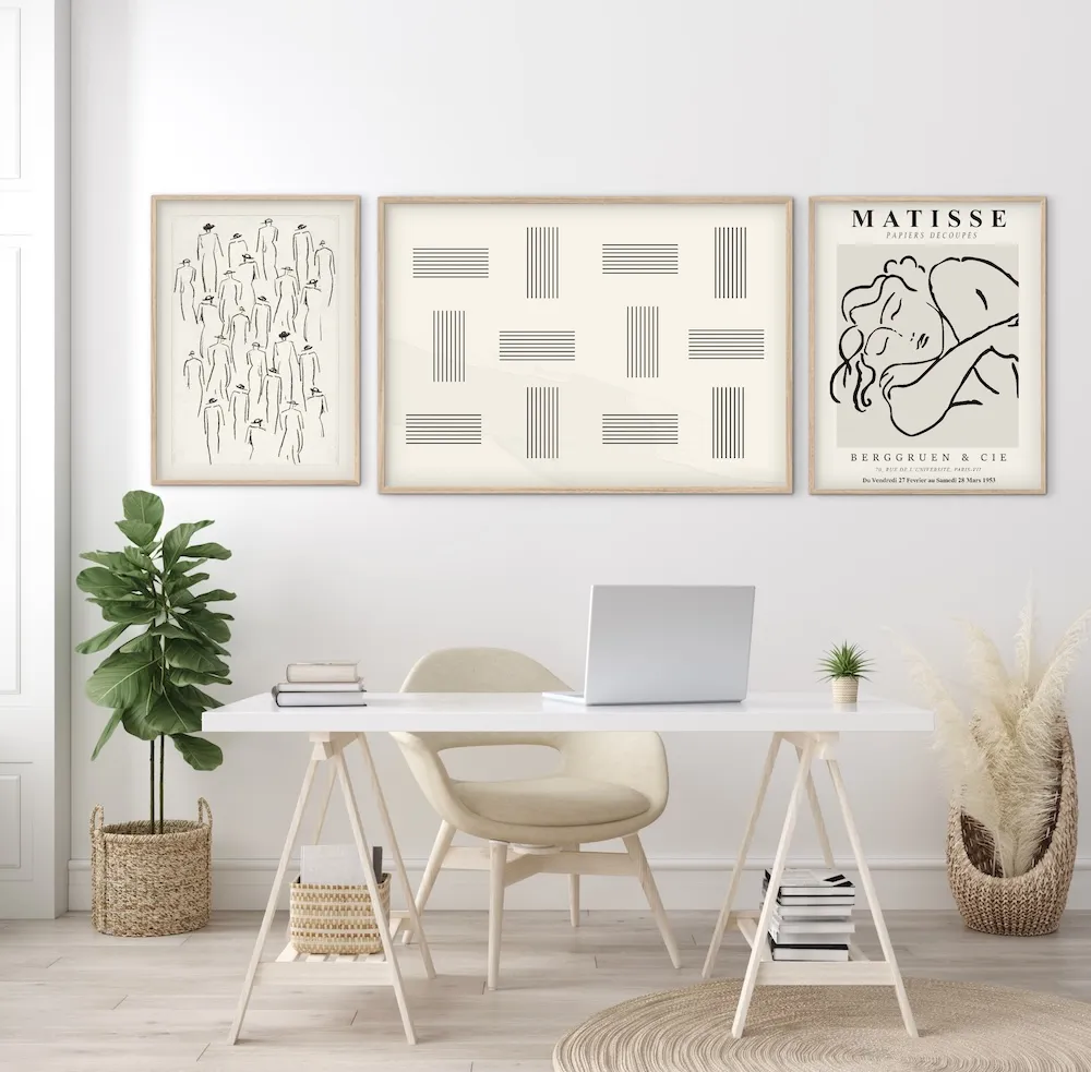
- Use frame finish as your accent colour. Black frames add graphic definition; natural wood or brass frames warm the room up; white or floating frames keep the whole wall nearly seamless. This one choice does a lot of the room’s personality work.
- Layer in texture, not colour, for warmth. If the wall of art feels a touch severe, soften it with a linen mat, a wood shelf beneath the frame for a small object, or warm-toned lighting directed at the piece — rather than reaching for a coloured accent wall.
- Consider a small curated cluster over the desk — two or three related black-and-white photographs, matted identically, hung with consistent spacing. This creates a “gallery moment” without overwhelming the calm of the room.
A white home office isn’t a blank slate out of a lack of imagination — it’s a deliberate choice to remove the noise so that light, texture, and art can do the work of shaping mood and character. Paired thoughtfully with monochromatic artwork, it becomes something rarer than a pretty room: a space engineered, quite literally, for clear thinking.