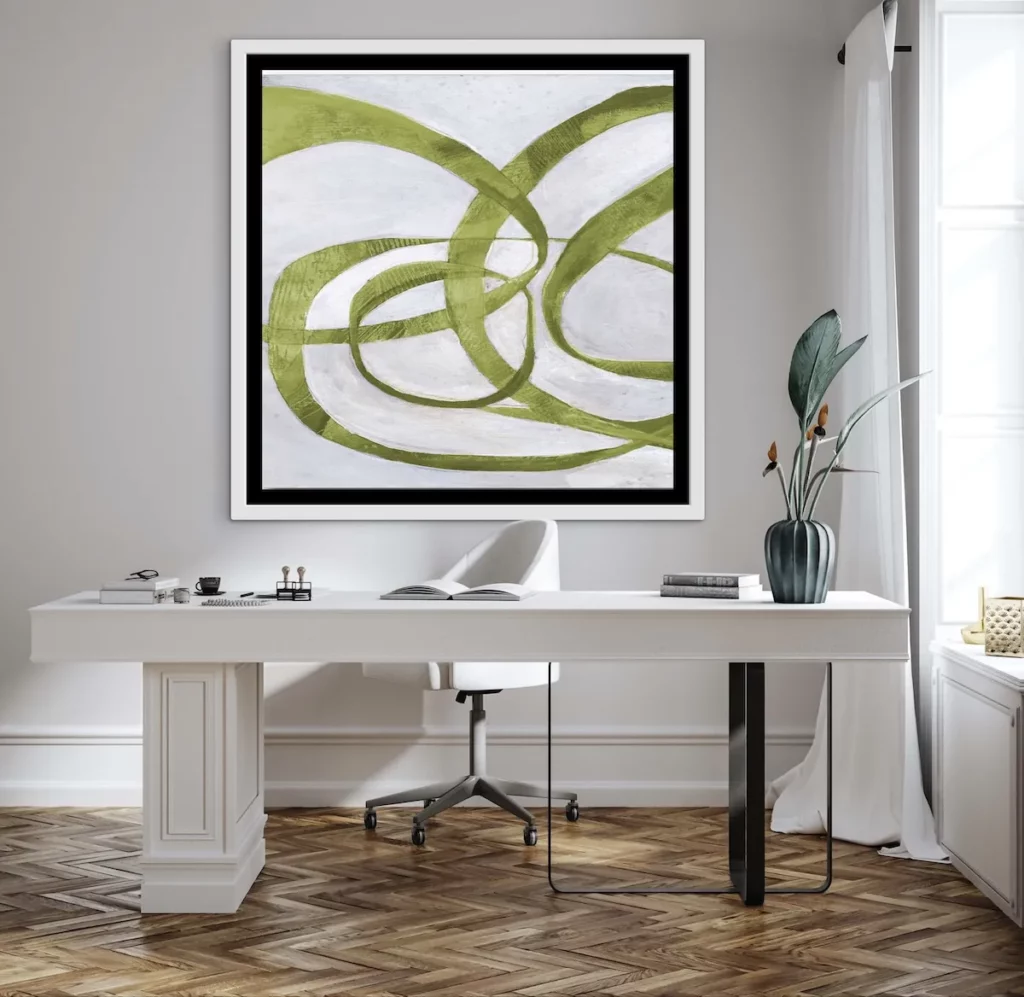
In the world of colour, few shades are as vibrant, daring and unexpectedly sophisticated as chartreuse. Sitting perfectly between yellow and green on the colour spectrum, chartreuse carries the freshness of spring foliage while radiating the warmth of sunlight. It is a colour that feels alive. Luminous and energetic, chartreuse has the rare ability to draw the eye immediately while still harmonising beautifully with a wide range of interior palettes.
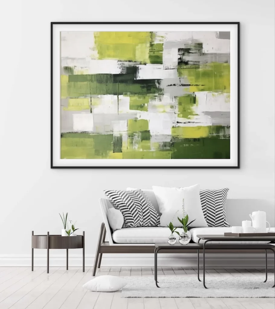
Originally named after the vivid green liqueur produced by Carthusian monks in France, chartreuse has long held a place in both design and fashion as a statement colour. Today it has become increasingly popular in contemporary interiors and art collections because it introduces a sense of modern vitality without feeling overly trendy. It feels both natural and bold at the same time.
Why Chartreuse Works So Well in Art
When used in artwork, chartreuse behaves almost like a built-in light source. Because it contains the brightness of yellow and the coolness of green, it reflects light beautifully and gives paintings or prints an immediate sense of energy. Even small accents of chartreuse can transform a composition, bringing life to darker palettes or adding a crisp, modern edge to neutral artwork.
Artists often use chartreuse to highlight movement or to create a focal point within a piece. In abstract art it can appear as striking brushstrokes that guide the viewer’s eye across the canvas. In figurative works it may appear in backgrounds, foliage, fashion elements or subtle colour contrasts that add depth and intrigue.
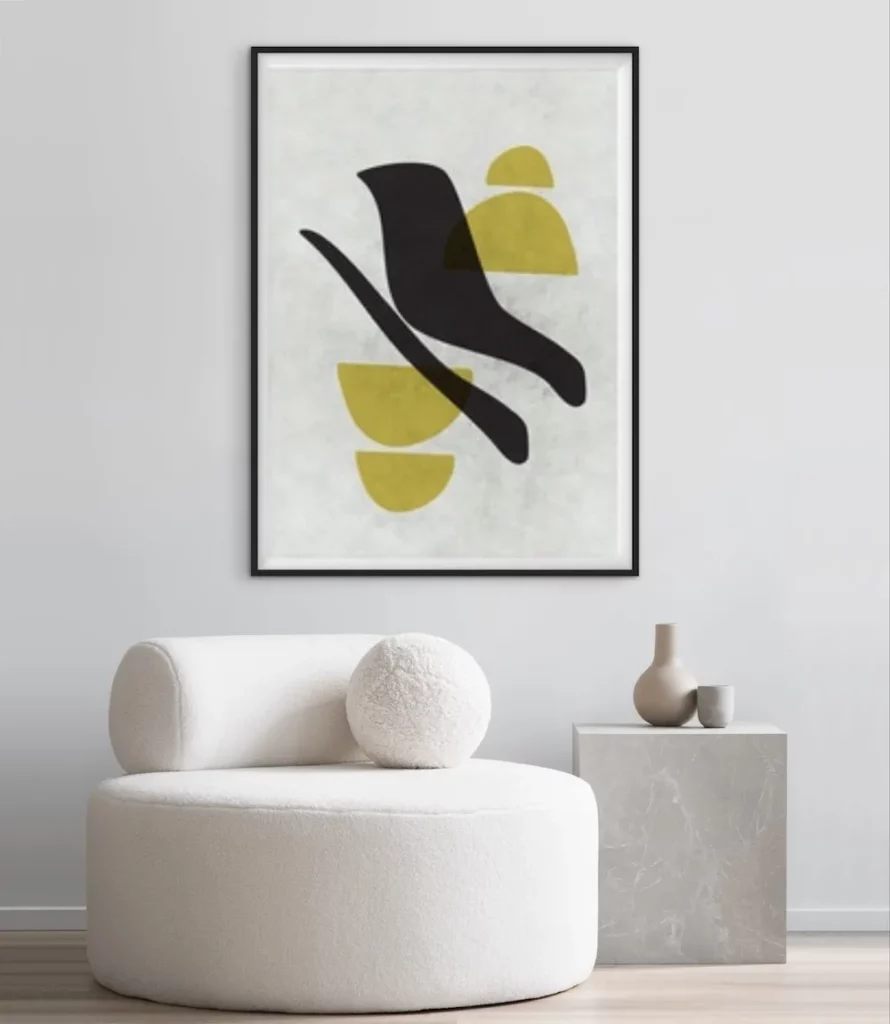
This colour also works exceptionally well in contemporary photography and pop-inspired artworks, where bold tones and strong contrasts create an energetic visual language.
Decorating With Chartreuse Art
One of the most exciting things about chartreuse is how effectively it lifts an interior. A room decorated in calm neutral tones can be instantly transformed with a single artwork that features this brilliant shade.
In modern interiors dominated by whites, creams, warm beige tones or soft greys, chartreuse artworks act as a visual spark. The colour introduces energy without overwhelming the overall calm of the room. Instead of adding multiple colourful objects, one striking piece of art with chartreuse accents can bring the entire space to life.
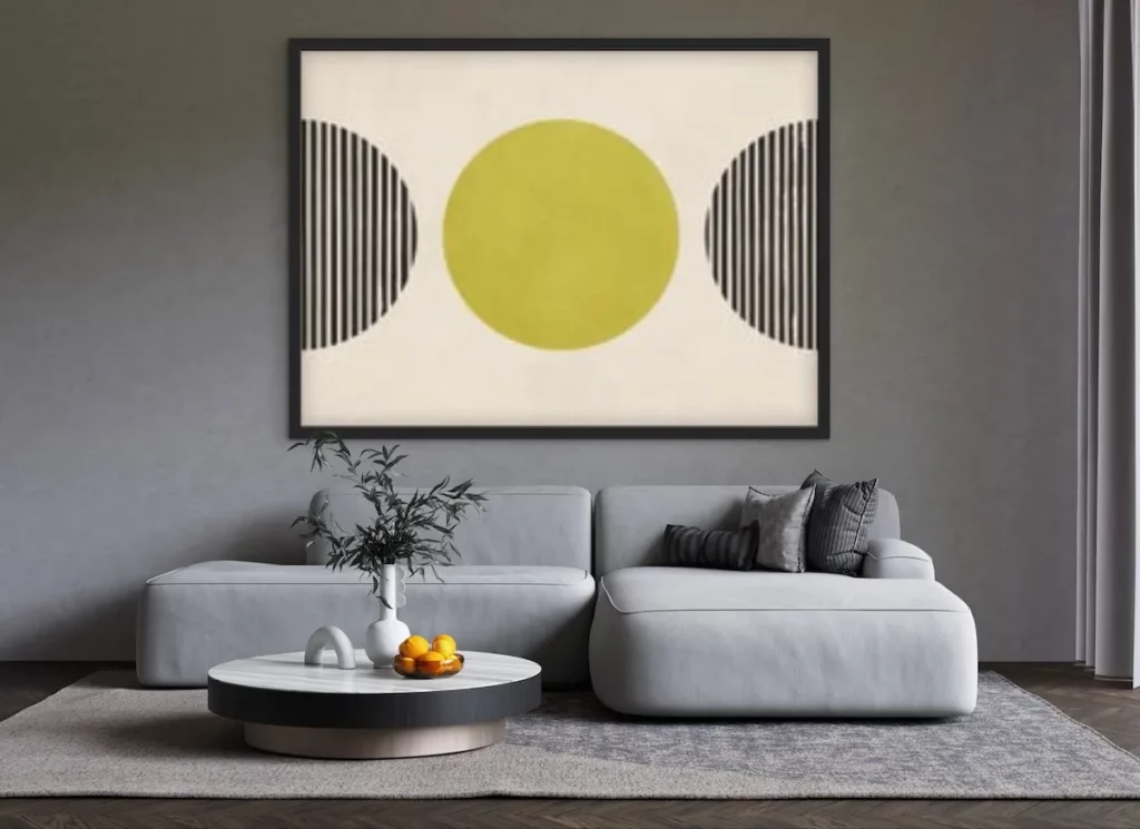
For those who prefer subtlety, look for artworks where chartreuse appears as a secondary accent rather than the dominant colour. A gentle wash of chartreuse in a landscape, an abstract line, or a geometric element can be enough to add interest without dominating the palette.
Perfect Colour Pairings
Another reason chartreuse works so beautifully in art is its versatility. It pairs effortlessly with many interior colour schemes.
Black and chartreuse create a dramatic and contemporary contrast. The brightness of chartreuse against deep black feels graphic, bold and very modern — ideal for statement artworks in minimalist spaces.
Deep blues and navy tones soften chartreuse and create a sophisticated balance. This combination feels rich and elegant, often seen in modern abstract pieces.
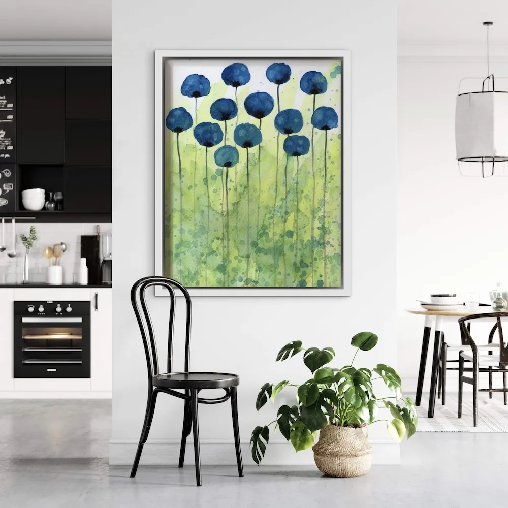
Natural wood tones allow chartreuse to feel organic and grounded. When displayed alongside wooden frames, furniture or flooring, the colour echoes the vibrancy of nature.
Soft neutrals such as ivory, stone and warm greys allow chartreuse to glow gently without competing with other colours in the room.
The Power of a Single Statement Piece
A common misconception when decorating with bold colours is that they must be used sparingly or avoided altogether. In reality, one carefully chosen artwork containing chartreuse can become the heartbeat of a room.
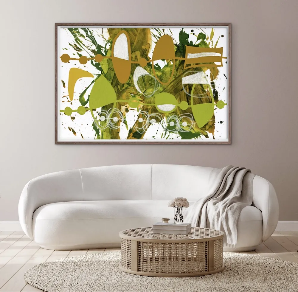
Placed above a sofa, in an entrance hall, or as part of a gallery wall, chartreuse art immediately captures attention. It introduces personality and contemporary flair while still allowing the surrounding décor to remain elegant and understated.
Because chartreuse reflects light so beautifully, artworks featuring this shade also tend to feel particularly vibrant in naturally lit spaces. Sunlight enhances the brightness of the pigment, making the artwork feel almost luminous during the day.
Chartreuse in Contemporary Art Collections
Collectors are increasingly drawn to chartreuse because it brings a modern energy to art collections. It feels playful yet sophisticated, bold yet refined. When combined with expressive brushwork, strong composition or striking photography, chartreuse can turn a piece into an unforgettable focal point.
For galleries and collectors alike, chartreuse represents optimism, creativity and movement — qualities that resonate strongly in contemporary art.
A Colour That Brings Joy
Ultimately, chartreuse is a colour that simply makes people feel good. It carries the vitality of nature, the brightness of sunlight and the freshness of spring all in one electrifying hue. When introduced through art, it brings optimism and vibrancy into a space without requiring a complete change of décor.
Whether through an abstract canvas, a striking photograph or a playful contemporary print, chartreuse offers an effortless way to inject personality, light and modern energy into a home.
And sometimes, all it takes is one brilliant flash of chartreuse on a wall to transform an entire room.